Refining the Visual Identity
Every great project starts with a single line of code, but for ICPCHUE, the true beginning was the moment we decided to break away from the standard 'white-page' documentation style. What started as a minimal Vite landing page quickly evolved into a comprehensive design system built on Glassmorphism and high-contrast aesthetics.
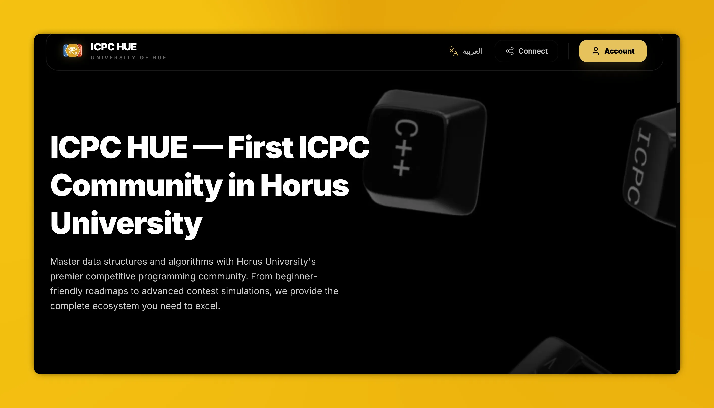
The Design Philosophy
Our goal was to create an environment that felt high-tech yet accessible. We moved away from generic flat design in favor of depth, using blurred backgrounds, subtle borders, and layered elements to create a 'premium' feel that distinguishes the platform from typical educational tools.
Key Visual Milestones
- The Glassmorphism Transition: Implementing
backdrop-filter: blur()and semi-transparent backgrounds allowed us to layer information without overwhelming the user. This created a sense of hierarchy and focus. - 3D Sticker Integration: To add personality, we custom-designed 3D-style 'sticker peels' that act as visual markers. These aren't just images; they are designed to give the interface a tactile, physical quality.
- Optimized Video Backgrounds: We integrated high-performance WebM backgrounds to provide movement and energy without the performance penalty of traditional video formats, ensuring the site remains fast even on lower-end devices.
- Brand Typography: We selected a bold, high-contrast typography system that ensures readability while reinforcing the platform's professional identity.
Technical Foundation
Before a single API route was defined, we spent days refining the React component architecture. We built a library of reusable UI primitives—buttons, cards, and modals—that follow these strict design tokens. This ensured that as the project scaled from a single landing page to a full-featured dashboard, the visual consistency remained absolute.
This 'Genesis' phase wasn't just about making things look good; it was about building a visual language that communicates competence and innovation. We established the yellow-and-black theme as our primary identity, a color palette that represents both energy and technical precision.